library(bkmr)
library(dplyr) #Charged for easier data manipulation. Part of the tidyverse.
library(ggplot2) #To make graphics
library(future) #For parallelizationBayesian Kernel Machine Regression (BKMR) Guide
1 Presentation of the model
Bayesian Kernel Machine Regression (BKMR) is a statistical method designed to model the complex relationships between a specific outcome (referred to as Y) and multiple set of predictor variables. This extensive set of variables includes both covariates (referred to as X) and exposure variables (referred to as Z). The model accounts for the collective effect of all exposure variables, known as the ‘mixture effect’, to estimate their impact on the outcome.
Y_i = h(z_{i1},...,z_{iM}) + \beta x_i + \epsilon i
For additional details on the mathematical aspects of the model, consider visiting the GitHub page created by J. Bobb, the developer of the {bkmr} package for R. This resource also offers a comprehensive guide on how to use the package, which can be particularly helpful if you require more information than what is provided in this document.
2 Using the model
To make this chapter clearer, you will find a walkthrough of each steps alongside the explanatory text.
Please note that this document and the code going with it was intended to run on R 4.3.2, with the bkmr 0.2.2. In the case that you encounter an error while running the code on your own, one possible explanation could be that a future R version will have a breaking change that will prevent this code from running.
First, we will load the necessary packages :
For the purpose of this guide, we will be generating some data by using the function provided by the package.
set.seed(111) #Data generation is using random number generation (RNG), we need to set a seed.
data <- SimData(n = 50, M = 4) #Generating a dataset of 50 observations and 5 predictor variables.
Your data will probably be in a dataframe (and not in a list like data), so we will transform them quickly.
dataset = as.data.frame(cbind(data$y, data$X, data$Z))

#Renaming the columns so its easier and cleaner when we'll need to isolate them.
colnames(dataset)[[1]] = "y"
colnames(dataset)[[2]] = "X"
Note: In your analysis, you will probably have a dataset with a lot of variable, and you may not want to test them all in the BKMR. To make the next steps easier, you should create a dataset containing only the variables that you want in the BKMR (that is, outcomes, exposures and covariates).
2.1 Data pre-treatment
2.1.1 Missing values
bkmr will throw an error if you provide it missing data. So the first thing to do is to impute or drop any row containing a missing value. In our case, we have a complete dataset, so we can proceed.
2.1.2 Binary or categorical covariates
If you have binary covariates or exposures, you need to code them in a 0/1 format, otherwise BKMR won’t be able to process them.
If you have multilevel categorical covariates, you will have to break them down in as many binary variable as necessary to cover all combinations.
Let’s take an example: We have a variable representing a color, with four levels: Blue, Red, Green and Yellow. We can’t put this variable in the BKMR model, because it wouldn’t make sense in the Gaussian kernel function. So, we need to create 3 binary variables to represent all the possibilities: is_red, is_blue and is_green, each of them being equal to 1 if the color was the one in their name. If all of them are equal to 0, then the color had to be Yellow (because we don’t have any missing values).
More generally, if you have a n-level categorical variable, you will need n-1 binary variables to cover all the cases.
You will find below a rather easy and automated way to breakdown your categorical variables:
#Let's first create a mock categorical variable
color_var = sample(c("Red", "Blue", "Green", "Yellow"), 50, replace=TRUE)

mat = model.matrix(~color_var-1) #The "-1" here removes the intercept from the produced matrix.

new_color_var = as.data.frame(mat)
new_color_var |>
  slice(1:10) #Displaying only the first 10 rows, so it does not take to much space on the document.
color_varBlue color_varGreen color_varRed color_varYellow
1 1 0 0 0
2 0 0 1 0
3 0 0 1 0
4 0 1 0 0
5 0 0 0 1
6 0 0 1 0
7 0 0 0 1
8 1 0 0 0
9 0 0 0 1
10 0 0 1 0As you can see, this code generates a 4th variable that represents the color Yellow. You can discard it, as it does not really provide additional information.
2.1.3 Binary or categorical exposures
For binary or categorical exposures, we recommend that you use the “machine values” variables if the frequency of detection is not too low (to be validated with your mentor). That is, the variables that contain the concentration found by the measurement method used on your samples. The value below the limit of detection (LOD) should be replaced by LOD/sqrt(2) or singly imputed using the fill in method (to be validated with your mentor).
2.1.4 Creating the three matrices that will serve as input data
The function kmbayes, which is responsible for running the model, only accepts matrices as input. In this step, we will also standardize our exposure variables. This is done by dividing the values by their standard deviation, and is done to make the comparison between each exposure easier. As biomakers tend to follow a log-normal distribution, we recommend to transform them by their natural log first, and only then to standardize them.
Note: The |> (pipe) operator is the native pipe from R, introduced in the 4.1.0. Basically, it passes the variable on its left-side as the first parameter of the function on its right side. You might be more familiar with the %>% operator, which serves the same function but requires the loading of the magrittrpackage.
exposures = dataset |>
  select(starts_with("z")) |>
  scale() |>
  as.matrix()

outcome = dataset |>
  select(y) |>
  as.matrix()

covariates = dataset |>
  select(X) |>
  as.matrix()
2.2 Running the model
Now that all the pre-treatment is done, we can run the model with the kmbayesfunction. To gain some time, we will only run 10 000 iterations, but you should set it to a higher number (see recommendations after the following code-block).
model = kmbayes(y=outcome, Z=exposures, X=covariates, iter=10000, varsel=TRUE, verbose=FALSE)Let’s breakdown the function:
y: The matrix with your outcome. Please note that this matrix should contain only one outcome. If you have multiple outcomes, you will need to loop through your outcomes and fit a BKMR model on them individually.Z: Your exposure matrix.X: Your covariate matrix.iter: The number of iterations of the Markov chain Monte Carlo (MCMC) sampler. The higher the number, the more reliable the model will but, but the longer it will take. J.Bobb recommends using 50 000 iterations and only keeping the last half, and then only keep 1 out of 5 iterations. This selection process is performed by the various functions of the package that we will call later.varsel: If set toTrue, not all variable will be put in the model every iteration. The base assumption is that only one quarter of the variable are really associated with the outcome. This parameter is needed if you want to have Post Integration Probabilities (PIPs), i.e. the proportion of iterations where the exposure was selected (r_m > 0)verbose: If set toTrue, will print intermediate diagnostic information during the model fitting.
There are a lot of other parameters that can be set in the kmbayes function that won’t be described here. You can find a complete description of these parameters in the package’s documentation (or by typing ?kmbayesin the R console)
2.3 Checking the results
2.3.1 Model convergence
You can visualize the convergence of the model by using the function TracePlotfor the different parameters (beta, sigsq.eps or r):
TracePlot(model, par="r",comp=2,sel=1:10000) #convergence of r2 (importance of the second exposure)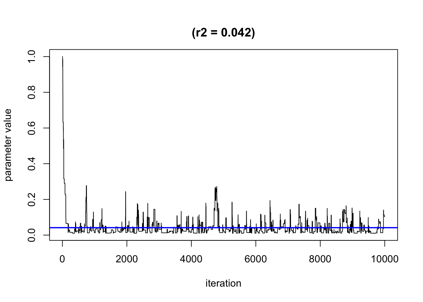
By default, it will only show the second half of the iteration, when the algorithm may have already converged. We recommend plotting all simulation using the parameter sel to see when the convergence happen (or not). Note: here the algorithm shows a very quick convergence of r2.
2.3.2 Quantify the importance of each exposure in the model
If you set varsel=Truein the model parameters, you can extract the Posterior Probability of Inclusion (PIPs) from the model by using the following function:
ExtractPIPs(model) variable PIP
1 z1 1.0000
2 z2 1.0000
3 z3 0.1334
4 z4 0.2814As you can see, z1 and z2 seem to be the two variables really associated with the outcome.
As a reminder, PIPs represents the percentage of iterations when a given exposure was selected.
2.3.3 Visualize your results
2.3.3.1 Overall risk
One graph that you will probably want to see and use in your papers is the “Overall risk graph”. It shows the changes in Y when all the exposures are set to a specific percentiles. This allow you to see the evolution of the changes in Y when their percentiles increases. These changes are relative to the percentile chosen as the reference. Just like with categorical variables in a linear regression, one level is chosen as the reference and the effects of the other levels are given based on that reference. By default, the reference in the 50th percentile, but you can change it.
For SEPAGES study, we recommend to display the overall risk from the 10th percentile to the 90, by increments of 10 percentiles. We also recommend to use the 10th percentile as a reference (a null exposure does not seem rationale for chemical exposure).
Similarly as for the univariate plots, you can choose to use the “exact” (unbiased but longer) or “approx” method (can be biased but is faster).
risks.overall <- OverallRiskSummaries(fit = model, y = model$y, Z = model$Z, X = model$X,
                                      qs = seq(0.1, 0.9, by = 0.10), #The percentile to display
                                      q.fixed = 0.1, method = "exact") #exact is more precise but slower than "approx"

ggplot(risks.overall, aes(quantile, est, ymin = est - 1.96*sd, ymax = est + 1.96*sd)) +
    geom_pointrange()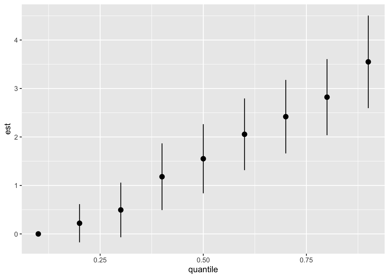
As we can see, the more the whole mixture increases in concentration, the greater the effect seen on Y. After the 40th, the confidence interval do not cross 0, meaning that the results are statistically significant.
2.3.3.2 Exposure-outcome function
Because we can’t view the surface of a high-dimensional model like BKMR, we will focus ourselves on a cross-section of one or two variables. By fixing all the exposures to their 50th (the median) percentile and holding all the covariates constant, we can visualize the variation of Y when Z varies.
#Creating the predicted univariate reponse
pred.resp.univar <- PredictorResponseUnivar(fit = model,method="exact") # exact method give unbiaised results but is longer to run

#Creating the graph
ggplot(pred.resp.univar, aes(z, est, ymin = est - 1.96*se, ymax = est + 1.96*se)) +
    geom_smooth(stat = "identity") +
    facet_wrap(~ variable) +
  ylab("h(z)")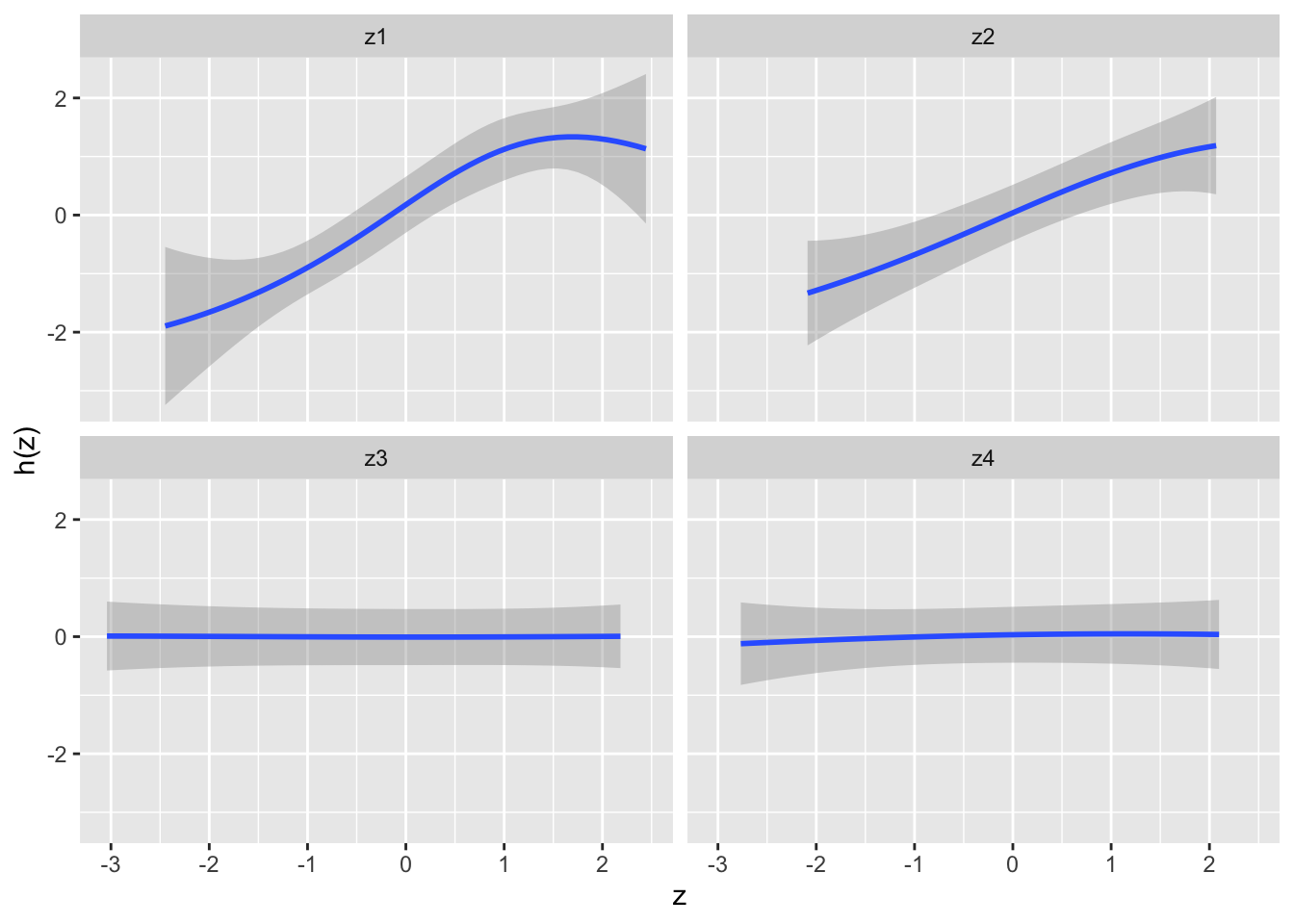
As we can see, z1 and z2 seem to be positively associated with an increase in Y. Furthermore, we can see that z1 seems to have a non-linear relationship with Y.
2.3.3.3 Single-predictor health risk
You may want to see the variations in h when a particular exposure Z is set to Ath and Bth percentiles. For example, you want to see the difference in the contribution of an exposure Z1 to the mixture, when this exposure is set at its 25th and 75th percentiles. All the other exposures will be sent to various percentiles, so that you can see the evolution of this difference when the mixture evolves. Let’s take an example:
risks.singvar <- SingVarRiskSummaries(fit = model, y = model$y, Z = model$Z, X = model$X,
                                      qs.diff = c(0.25, 0.75), #The two percentiles to compare
                                      q.fixed = c(0.25, 0.50, 0.75), #The percentiles at which the other exposure will be set
                                      method = "exact") #Indicates the degree of precision of the computation. "exact" is more precise, but takes more time than "approx"

ggplot(risks.singvar, aes(variable, est, ymin = est - 1.96*sd,
                          ymax = est + 1.96*sd, col = q.fixed)) +
    geom_pointrange(position = position_dodge(width = 0.75)) +
  coord_flip()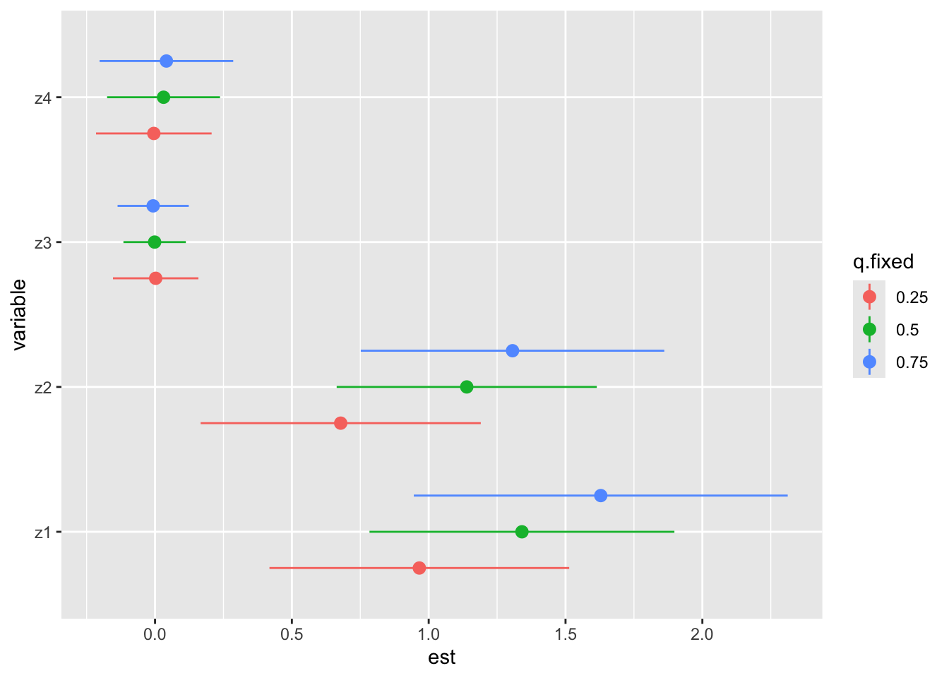
Here, we can see that z4 and z3 don’t seem to really contribute to the effect on Y, which is coherent with what we saw on the previous graph. Regarding the effects of z1 and z2, we can see that they increase with the increase of the concentration of the mixture. Therefore, we can speculate that z1 and z2 may have some sort of interaction with other compounds in the mixture.
Two possibilities for univariate (and overall) plots are available: - “Approx” method: estimates the posterior mean and the posterior variance of h(z) using the posterior mean of all other parameters. This approach is very fast but is only an approximate method. Warning: this method can underestimate credible intervals, therefore increasing the false discovery probability, we recommend to use it for testing and confirm results with the 2nd approach. - “Exact” method: estimates the posterior mean and variance of h(z), using many simulations of the parameters instead of only their mean. This approach is fast for moderate sized datasets but can be slow for large datasets.
2.3.3.4 Note about the graphs
Because the graphs are made with ggplot2, don’t hesitate to change the axis labels or adding other elements that can make the graphs more easier to read/understand. For example, you’ll find below some ideas to make the “Overall risk” graph a little bit easier to read:
ggplot(risks.overall, aes(quantile, est, ymin = est - 1.96*sd, ymax = est + 1.96*sd)) +
  geom_pointrange() +
  geom_hline(aes(yintercept=0), color="red") +
  labs(y = "Effect on outcome", x="Mixture quantiles")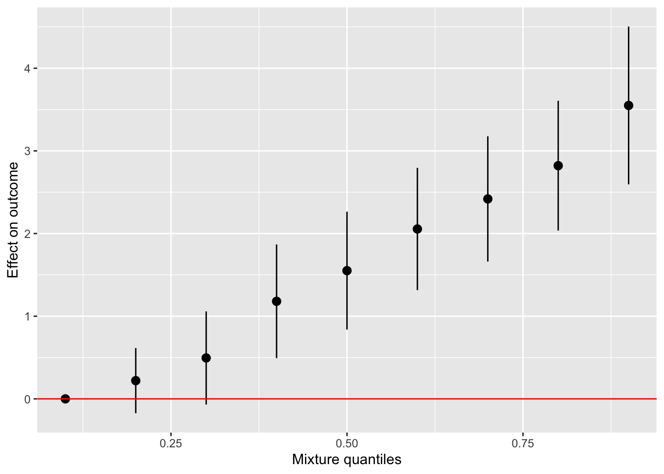
2.3.3.5 Note 2 about the graphs
This guide will not cover all the graphs that can be produced by the bkmr packages, such as the one allowing to see the interaction between two compounds. We recommend you explore the original tutorial by Bobb.
3 Using previous results to inform BKMR
3.1 Using previous EWAS results (unipollutant models)
If you mix pollutants associated in the opposite direction with the outcome, the risk is to get a null “overall” risk. Therefore, you could try two options:
You can do two separate BKMR for pollutants with a positive vs negative association with the outcome.
You can multiply by -1 the pollutants with a negative association so that all pollutants are associated in the same direction with the outcome.
3.2 Using correlations between pollutants
If a group of pollutant is highly correlated, you could try hierarchical BKMR (see section “BKMR’s extension) to avoid multicolinearity issues.
4 BKMR’s extension
4.1 BKMR with groups of variables
With a large number of correlated exposures, it is recommended to define groups of variables to run BKMR models. Variables that are have correlation between them should be put in the same group. BKMR will then compute PIPs for each group, and will consider a priori that only one exposure from each group will be used to model the outcome. The aim of BKMR by group is to avoid multicollinearity by selecting the most important exposures in each group to represent each of them (a bit like LASSO models).
4.2 BKMR with time varying exposures
When the exposures are time-varying, there is no explicit solution but we recommend :
Option 1: Run the BKMR model for each time point
Option 2: Use a hierarchical version of the BKMR model with the set of exposures at all time points, with exposures grouped by time point. The relative importance of each time point group is estimated (group PIP), and then the relative importance of each exposure within the time point group is estimated (individual PIP). Exposures can also be grouped by family using the hierarchical version.
5 The limits of BKMR
Of course, BKMR is not a perfect model, and it can have some limitation.
5.1 Interpretation of the results
You should keep in mind that the output of BKMR is a n times n response function (where n is the number of considered exposures). In order to interpret the results, scientists must simplify the problem using univariate response graphs (one exposure varies and the others are fixed), binary response graphs (two exposures vary and the others are fixed) or an overall response graph (all exposures vary identically). These are only three snapshot of the model, but do not really represent the model has a whole.
5.2 Computational time
Running BKMR models can be really expensive time wise. You should really consider using code palatalization to make the whole process “faster” (more on that in the next section), especially if you are dealing with databases of similar size than SEPAGES’s. You will probably several hours to have all your results. Therefore, you should first run your models on a small number of iteration (~100 iterations) just to see if all your variables are in the model.
5.3 Parallelization
Parallelization allows you to run several processes (here, computations) in parallel. In the case of computational heavy models, this can be a real time saver. You have several option to do that, but here we’ll use the package “future”. If you are using “workflow management package”, like “targets”, they will probably have something already implemented in them to help you with that. Here, we’ll assume that you are working a workflow, just by putting R scripts one after another (which is a perfectly valide way of doing things.).
To give you a really quick explanation, when using “future”, the package will create what we call “Promises”. Basically, it will tell R that it will give it a value for the variable, but that the computation is still running and that it will have to wait an little. We will therefore tell R to wait for the resolution of all the promises, and then continue with the code (because if you don’t, the code will try to access a variable that does not have a value yet, and the code will crash).
Before making call to future’s functions, you will have to specify which “plan” the package will need to follow. There a several plans, but the one that you will probably want to use is the “multisession”. Specifing a plan is done by using the plan function :
plan(multisession)To initialize a promise, you use the following code :
var = future({
  ## Your code here
  return(1 + 1)
})

result = value(var)

result
[1] 2You can make the code between the {} as complexe as it needs to be. Then you need to call the function value to wait for the resolution of the promise. This function will, as told earlier, block your code and wait for all the promises. Here, you had an example for one promise, but you can (and will probably want) to create a lot of promises quickly, and store their results in a list. This will be the case if you want to run several BKMR models.
var_list = vector("list", 5)

for (i in 1:5) {
  var_list[[i]] = future({
    return(1+1)
  })
}

var_list = lapply(var_list, value)

var_list
[[1]]
[1] 2
[[2]]
[1] 2
[[3]]
[1] 2
[[4]]
[1] 2
[[5]]
[1] 2The list is set up with the vector function, which is useful when you already know the number of models you need to run. By initializing a list of the appropriate size and populating it sequentially, you save more memory compared to repeatedly expanding a list. You will have to use a lapply function to apply the value function to each element of the list.
5.3.1 Time comparison between parallelized and non-parrallelized code
In this section, we will execute five BKMR models sequentially, meaning each model will run one after the other, similar to a standard R script process.
Note: If you want to have a “real life equivalent” for this sample code, you can imagine that you have a BKMR to ran on five outcomes, with the exact same set of covariates and exposures. The only difference with this sample code would be that you would need to change the outcome matrix given to the kmbayes function at every iteration.
Subsequently, we’ll measure and compare the time this takes to the time when the models are run in parallel.
plan(sequential)

start = Sys.time()

model_list = vector("list", 5)

for(i in 1:5) {
  model_list[[i]] = future({
    model = kmbayes(y=outcome, Z=exposures, X=covariates, iter=10000, varsel=TRUE, verbose=FALSE)
    return(model)
  }, seed = 111)
}

results = lapply(model_list, value)

end = Sys.time()print(end - start)Time difference of 59.24118 secsplan(multisession)
start = Sys.time()
model_list = vector("list", 5)
for(i in 1:5) {
model_list[[i]] = future({
model = kmbayes(y=outcome, Z=exposures, X=covariates, iter=10000, varsel=TRUE, verbose=FALSE)
return(model)
}, seed = 111)
}
results = lapply(model_list, value)
end = Sys.time()print(end - start)Time difference of 27.15735 secsAs observed, executing the modes sequentially takes approximately one minute, while employing the multisession plan reduces this time to about 30 seconds, cutting the computational time in half. However, a more realistic expectation for time savings is typically around a 30% reduction. It’s important to note that the effectiveness of parallelization varies depending on several factors: the available resources on your computer, the size of the model being used, and certain unpredictable elements. These unpredictable elements are not entirely random; they depend on background processes and how your computer’s resources are being utilized.